
Re-designed a prompt-sharing social platform transform their website into a responsive, user-friendly experience.
Promptlys is a prompt-sharing social platform that helps people ask better questions and exchange their insights through the power of community.
Role
I was the sole designer of this product, from user research and product strategy to UX/UI design, prototyping, and usability testing. I collaborated closely with the lead developer/ PM to take this product from 0 -> 1.
The primary challenge was determining whether prompt framing—a skill crucial for generative AI interactions—could be effectively solved through community, via a prompt sharing platform.
Our goal was to validate this hypothesis before committing to a full-scale MVP.
Before

After
The Problem
Users struggle to create effective AI prompts, leading to:
Users find it challenging to create prompts that get the desired results.
Poorly constructed prompts lead to wasted time and money.
Improper prompt etiquette limits AI tool interactions.
Through research, we sought to answer:
Does a social platform help users improve prompt writing?
If so, what core features are necessary for engagement and knowledge-sharing?
How should we design an intuitive and scalable solution?

❗️ Core Challenges
After speaking to interviewers and conducting market and competitive analysis, I have found that:
There is a pattern of people wanting to become better at using generative AI.
Experienced users displayed some dissatisfaction with the limitations of ChatGPT’s outputs.
There is a strong sense that credibility is an important value for people in this space.
The main target market for Promptlys would be people who like to lean on the community
Brainstorming
With the trinity of goals in mind, I started brainstorming on the product side, far and wide and across different industries, using mind maps, successes from platforms in other industries, to expose different questions that could be asked by a product designer and product manager. Before the brainstorm, our problem space led to some important questions to ask:
How might we educate people about the possibility of improving prompts?
How might we build trust in this space?
How might we foster community for those who need it?
How might we create space for users to monetize?
How might we define user vs. development problems?
Prioritization
Through brainstorming, feature ranking, and card sorting, we identified four key flows:


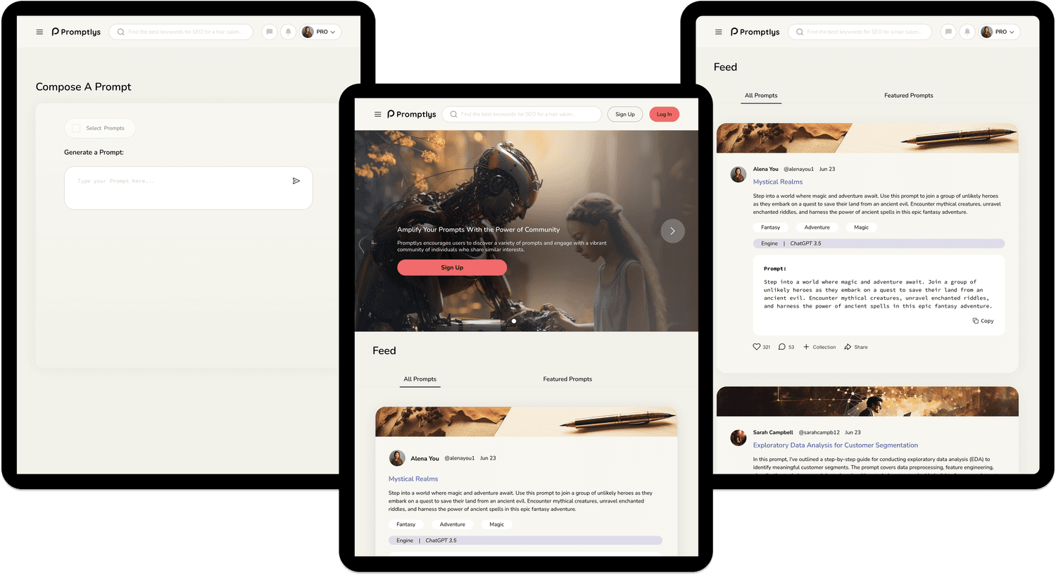
The Re-Design
After the prioritization of features, Promptly's needed a whole design overhaul.
Why an Overhaul?
The original platform had major usability issues that made it hard for users to understand what it was supposed to do. The navigation was confusing, key features weren’t clear, and the overall experience felt disconnected. I had to take a step back to really figure out its purpose before diving into the redesign. This overhaul was about stripping things down, refining the core experience, and making sure the platform actually worked for the people it was built for.
Current Usability Challenges
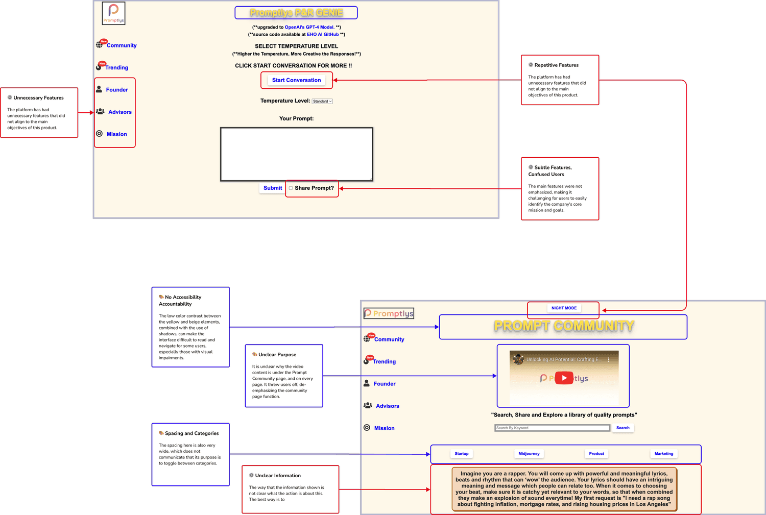
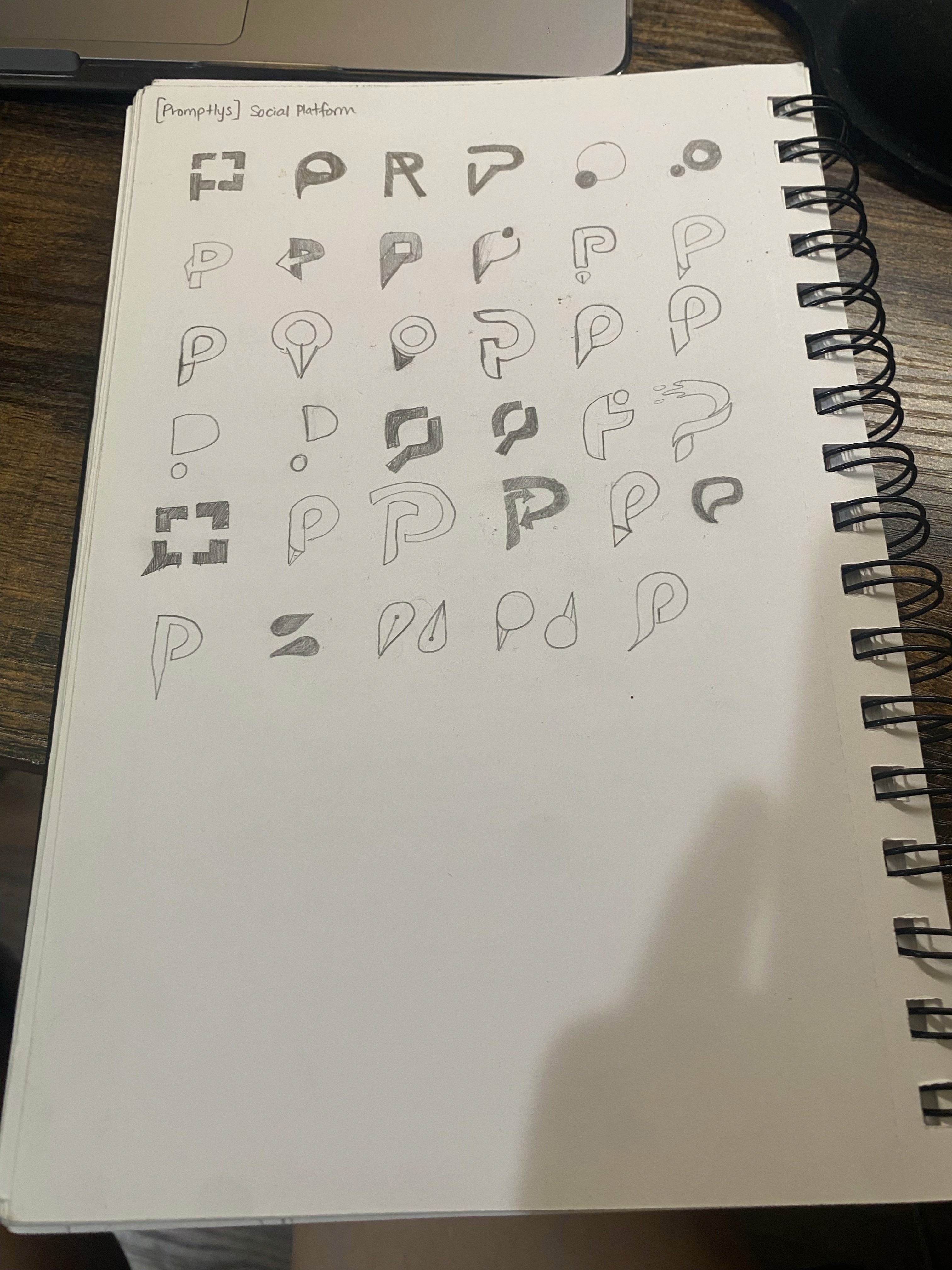
Branding and Visual Identity

To understand how users navigated Promptlys and where they got stuck, I ran a usability test with five participants across three core tasks. The goal was to catch friction points, measure success rates, and see how intuitive the platform felt.
What We Found
People liked the UI - it felt clean and modern.
Navigation was smooth for the most part.
Users needed better onboarding—some weren’t sure where to start.
Text-heavy sections felt overwhelming—collapsing certain areas would help.
The experience differed for logged-in vs. anonymous users—this needed clearer paths.
What We Fixed
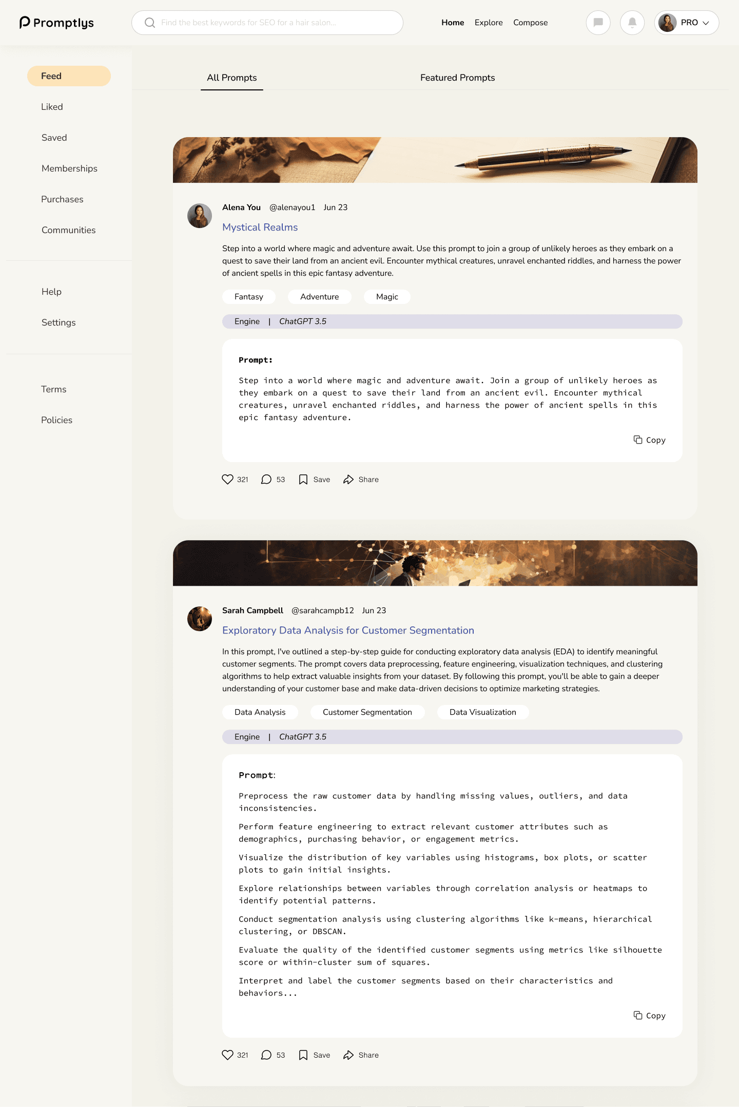
Made the sidebar sticky for quick access
Added tags to different between GPT-3.5 vs. GPT-4 prompts.
Renamed “Collections” to “Saved Prompts” for clarity.
Made key sections collapsible to reduce visual overload.
Cleaned up redundant buttons for a sleeker experience.
These changes made finding, saving, and contributing prompts easier, reducing user friction and ensuring a more intuitive, engaging experience.


Key Takeaways:
Data-driven design decisions are crucial; research prevents missteps.
As a new platform, testing early and often is vital to refine the product.
User preferences vary, so it’s important to let user feedback and data guide the design.
This project wasn't just about a redesign—it was about creating a product that aligns with user needs and business goals.