Designing a prompt-sharing social platform to level up AI prompt writing
Promptlys started with a big idea: what if users could get better at writing prompts for tools like ChatGPT just by learning from each other?
Most people feel unsure about how to talk to AI. They don’t know what to ask, how to structure prompts, or what others are doing. I joined Promptlys as the sole designer to help turn this idea into a working product.
From 0 → 1, I led everything from research and strategy to UX/UI, prototyping, and testing — collaborating directly with the founder (PM/engineer) to validate the direction.
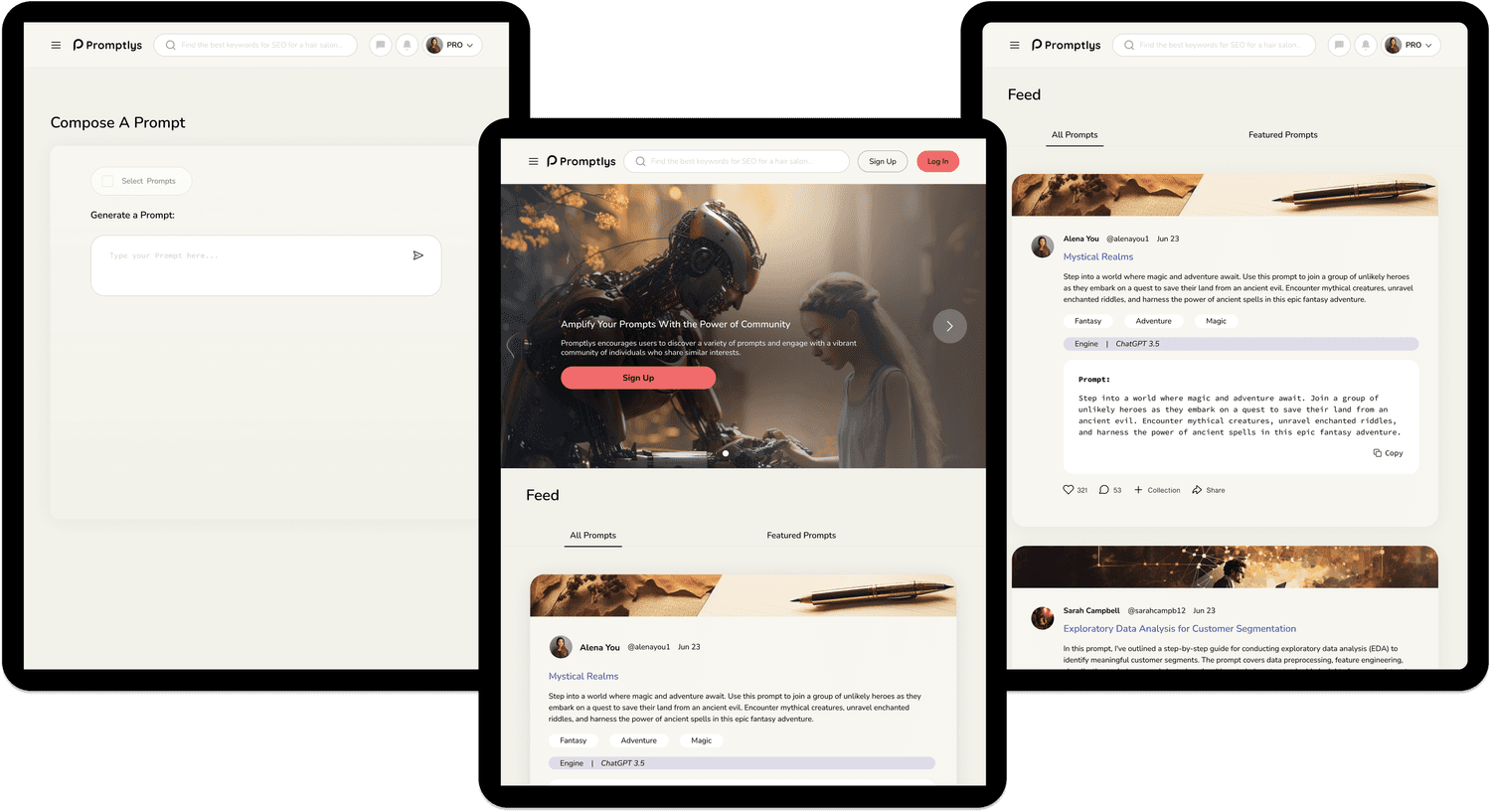
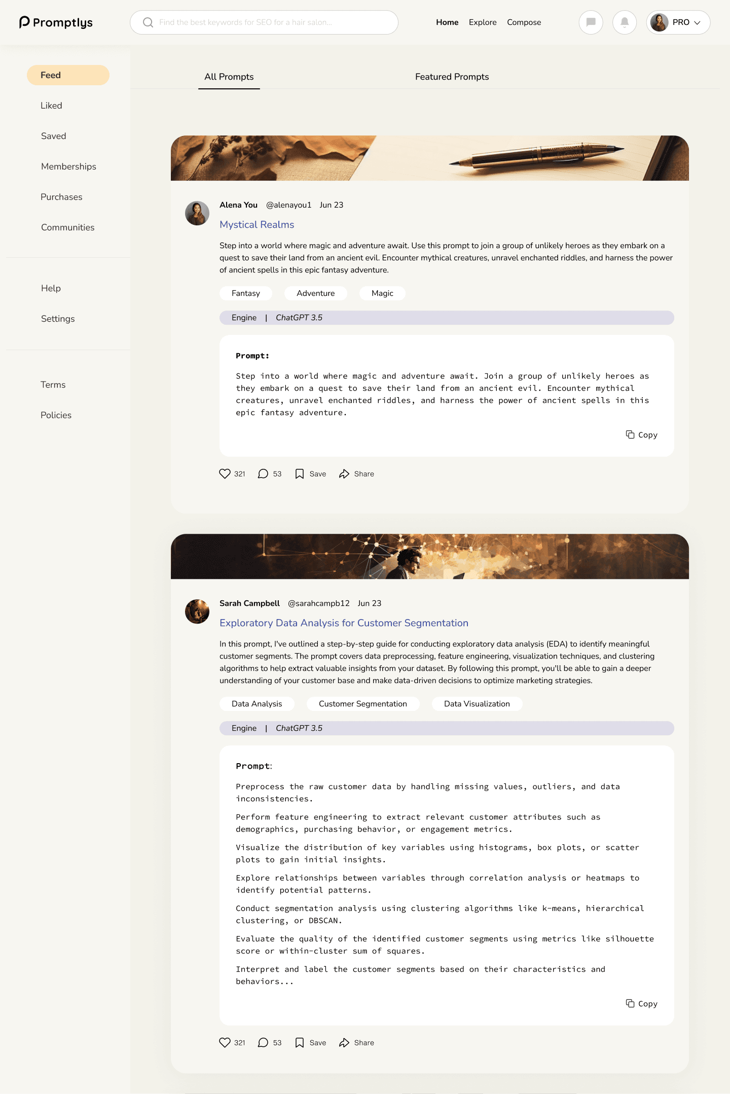
Before

After
The Problem
AI tools are powerful - but only if you know how to talk to them. Prompt-writing isn’t just a skill gap, but a usability problem. New AI users often struggle to write effective prompts, leading to vague outputs, wasted tokens, and frustration. Even experienced users can fall into trial-and-error loops, unsure how to improve or iterate.
Through research, we sought to answer:
Can a social platform actually help people become better at prompt writing?
What core mechanics would make prompt sharing feel engaging, credible, and valuable?
And how can we make that experience intuitive and scalable as the AI space evolves?

❗️ Core Challenges
From user interviews and competitive analysis, a few key patterns stood out:
People want to get better at using generative AI—but don’t always know how.
Even experienced users feel ChatGPT’s outputs fall short without the right prompts.
Trust matters. Users want credible sources and a community they can learn from.
The ones most excited about Promptlys? Those who thrive on collaboration and shared knowledge.
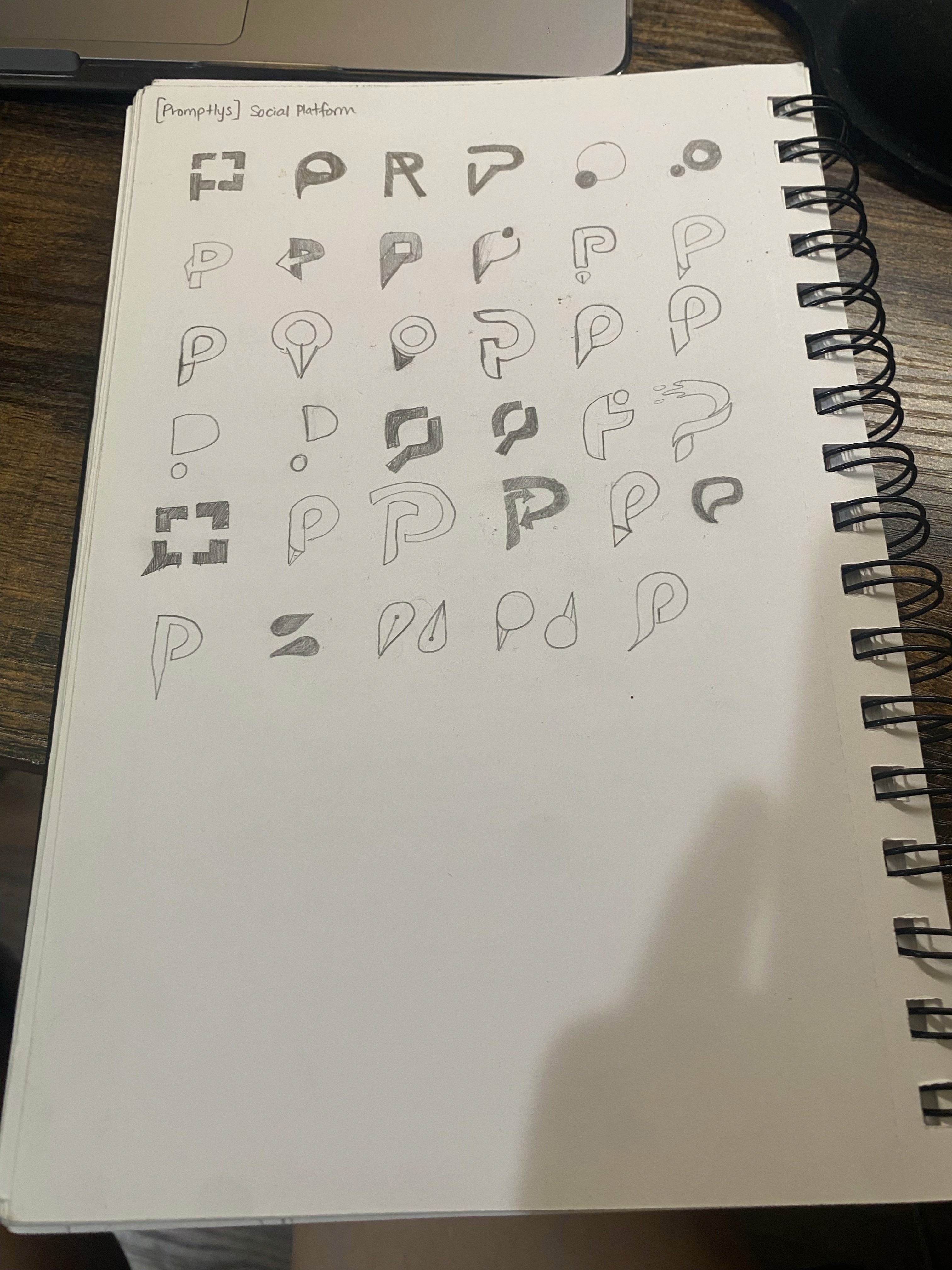
Brainstorming
With the trinity of goals in mind, I started brainstorming on the product side, far and wide and across different industries, using mind maps, successes from platforms in other industries, to expose different questions that could be asked by a product designer and product manager. Before the brainstorm, our problem space led to some important questions to ask:
How might we educate people about the possibility of improving prompts?
How might we build trust in this space?
How might we foster community for those who need it?
How might we create space for users to monetize?
How might we define user vs. development problems?
Prioritization
Through brainstorming, feature ranking, and card sorting, we identified four key flows:


The Re-Design
After the prioritization of features, Promptly's needed a whole design overhaul.
Why an Overhaul?
The original platform had major usability issues that made it hard for users to understand what it was supposed to do. The navigation was confusing, key features weren’t clear, and the overall experience felt disconnected. I had to take a step back to really figure out its purpose before diving into the redesign. This overhaul was about stripping things down, refining the core experience, and making sure the platform actually worked for the people it was built for.
Current Usability Challenges
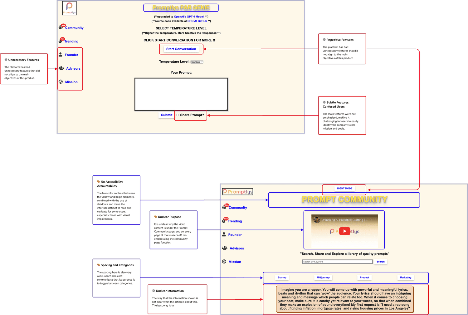
Branding and Visual Identity

To understand how users navigated Promptlys—and where they got stuck—I ran a moderated usability test with 5 participants across 3 core tasks. The goal: uncover friction, test comprehension, and surface first impressions.
What We Observed
Before
Users were confused by “Collections”, they didn’t understand what it stored.
Some weren’t sure where to start; the onboarding was unclear.
Text-heavy sections made key content hard to parse.
Anonymous users had a very different experience than logged-in users, with no guidance.
After
Renamed “Collections” to Saved Prompts for better clarity.
Added a sticky sidebar for easier access to key actions.
Collapsed heavy content blocks to reduce visual noise.
Improved onboarding flow to guide new and anonymous users.
Cleaned up redundant buttons for a sleeker, faster experience..
These changes drastically improved usability and task success rate. Users moved through the platform with more confidence, understood what to do next, and shared that the platform now “feels like something I’d come back to.”