Designing the AI pocket planning experience
Background
Ideas die in notes. They should become plans.
Five friends. A free weekend. A lot of constraints and no idea where to go. That group chat spirals. The plan never happens. The weekend becomes nothing.
Please was built on a simple hypothesis, validated across 100 interviews with creative professionals: ideas should become plans. Plans should be something you actually do.
Creative professionals generate ideas constantly. Those ideas land in notes. They sit in reminders. They expire quietly. Please was designed to catch the idea at the moment it forms and turn it into an executable plan, backed by AI and finished by human concierges.
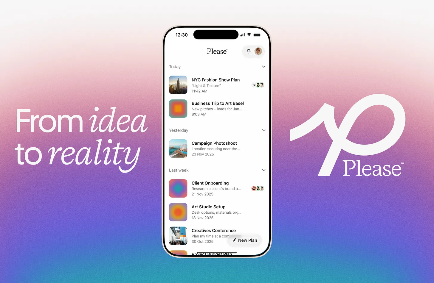
The Problem
3 products, 1 application, fragmented experience.
The product had three distinct moments:
brainstorming with AI
structuring a plan
handing off to a human concierge
Users didn't know when AI was talking and when a human was involved. They didn't understand that adding something to a plan meant it would live somewhere else. The whole experience felt like three products duct-taped together.
Here are the major questions when I came into the role:
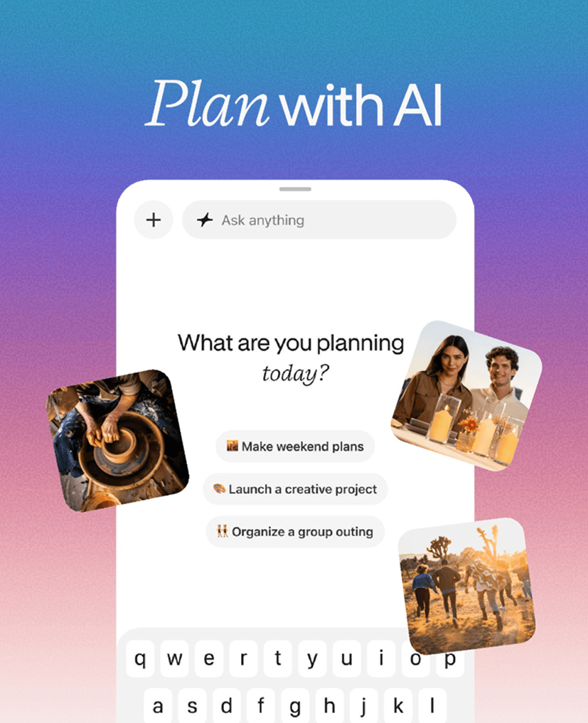
How might we make the transition from idea to plan like one seemless product?
Spark idea —> Edit plan —> Execute plan
The product risked feeling like three separate tools: an AI chat, a planning surface, and a concierge layer for task-specific help.
To unify them, I mapped the underlying user journey: Spark → Plan → Go — a simple three-step arc that most users would follow when trying to cover the bases of any plan. This gave the three surfaces a narrative spine rather than letting them sit as disconnected modes. Even without knowing exactly who our users were, the planning process itself was predictable enough to anchor the structure.
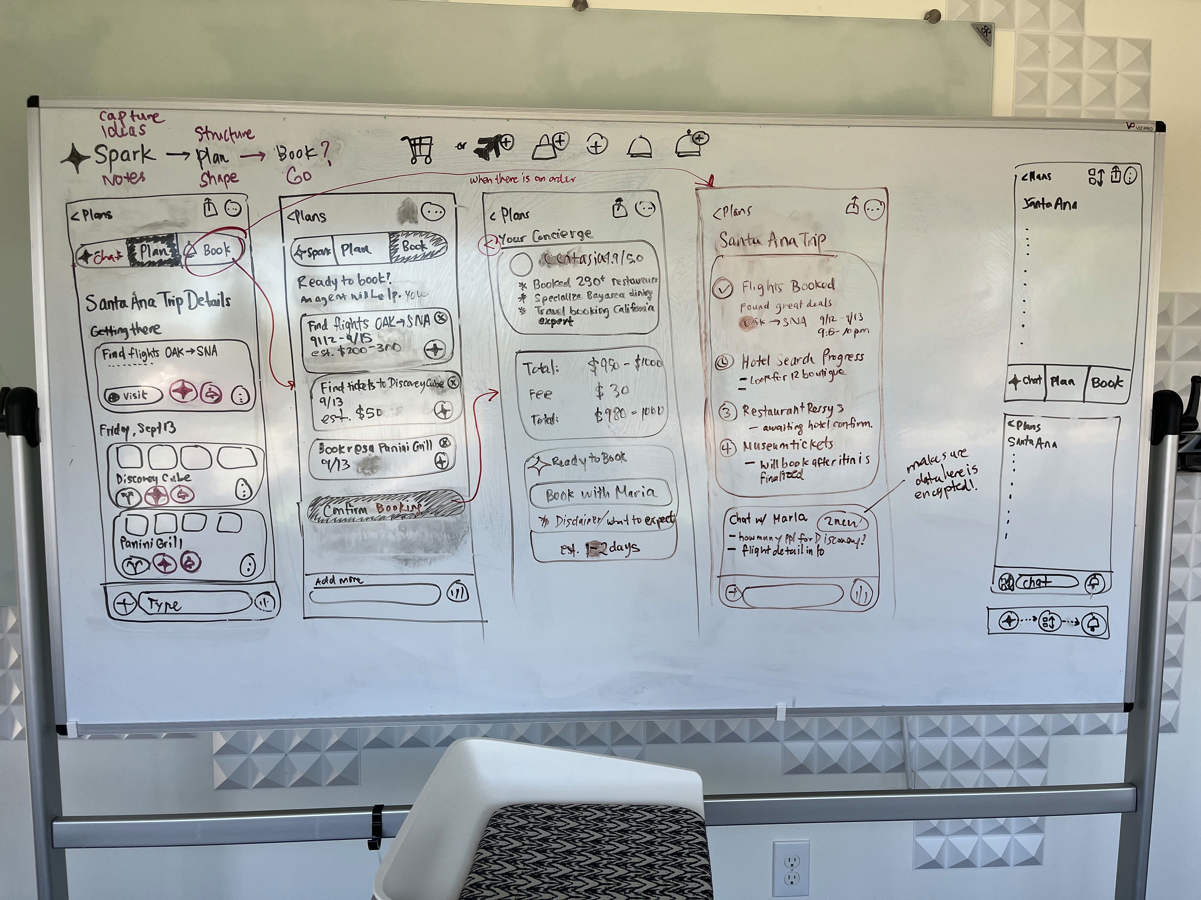
The Concierge Flow Early Exploration
How might we help users go from a vague idea to something executed, booked, confirmed?
Design for Guidance + Collaboration
The features that mattered most were:
first-time experience that explains what an AI-generated plan actually is without slowing the user down
the ability to share plans with friends so collaboration could happen naturally
a concierge layer robust enough to support multiple concurrent assistants working on different parts of the same plan.
All of these designs were designed with the plan surface as the forefront and educating users how they would use the app better.
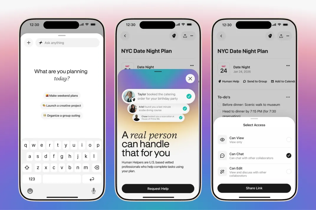
The First Time User Experience + Sharing
How might we help assistants and experts help support customers properly?
Designing for the Complexity of Human Assistants
Demand for human assistants inside the app was real and high but the execution complexity was significant. Assistants were working from a mobile device, often juggling multiple customers simultaneously, which meant the tooling had to match that reality. A single assistant might be handling three active tasks at once, each requiring them to browse across different sites, switch contexts, and track progress without losing the thread.
Payments added another layer. Assistants needed a secure way to make purchases on a customer's behalf. The solution was a Please card that the assistant could use to pay, keeping the financial flow clean and accountable. On the user side, booking request cards handled the money exchange, functioning like Apple Cash but scoped to a specific confirmed booking, so payment was tied directly to the action.
There were a lot of moving parts. The piece I'm most proud of is the multi-task bar - a persistent element anchored to the active concierge chat, giving assistants a clear reference point no matter where they were in the flow. From it, they could cancel requests, manage assistant items, and stay oriented across concurrent work. It was one of those solutions that looked simple on the surface but did a lot of quiet heavy lifting.
Shipped: Concierge Flow Actions Per Task
The Results
Shipped in a quarter, minimal bugs, owned core flow.
After the launch, I launched 6 surfaces, 90 days, an iOS launch, with the core flow owned end-to-end.
It revealed that use cases were too broad. You can go anywhere from planning your weekend out to planning for colon cancer. FTU also bounced users before core experience.
What this project taught me the most is how to design when the problem itself is the unknown variable. This means there are much more emphasis on helping the team define the right users and the right strategy to find that problem.
Reflection
What I'd do differently
I would dig deeper into the problem further to make sure it's the right problem to solve.
While the project taught me how to design when the problem itself is the unknown variable, it is best to dive deeper using First Principles or product exercises to make sure we are solving the proper problem.
I would have voiced design concerns earlier, and pushed back more.
On the concierge flow, I had the instinct and sat on it to move fast. I know now that raising a concern is not the same as having the solution. Saying "I think this assumption needs testing" is a design contribution. Silence is not.
I would have treated the FTU as the hypothesis test from day one.
We shipped a product to test whether ideas could become plans, but the entry point was unclear that users never reached the core experience. We couldn't learn because users didn't get past. The FTU wasn't a nice-to-have polish pass. It was the experiment itself, especially for a new concept like this. I'd fight for that framing at the start next time.
