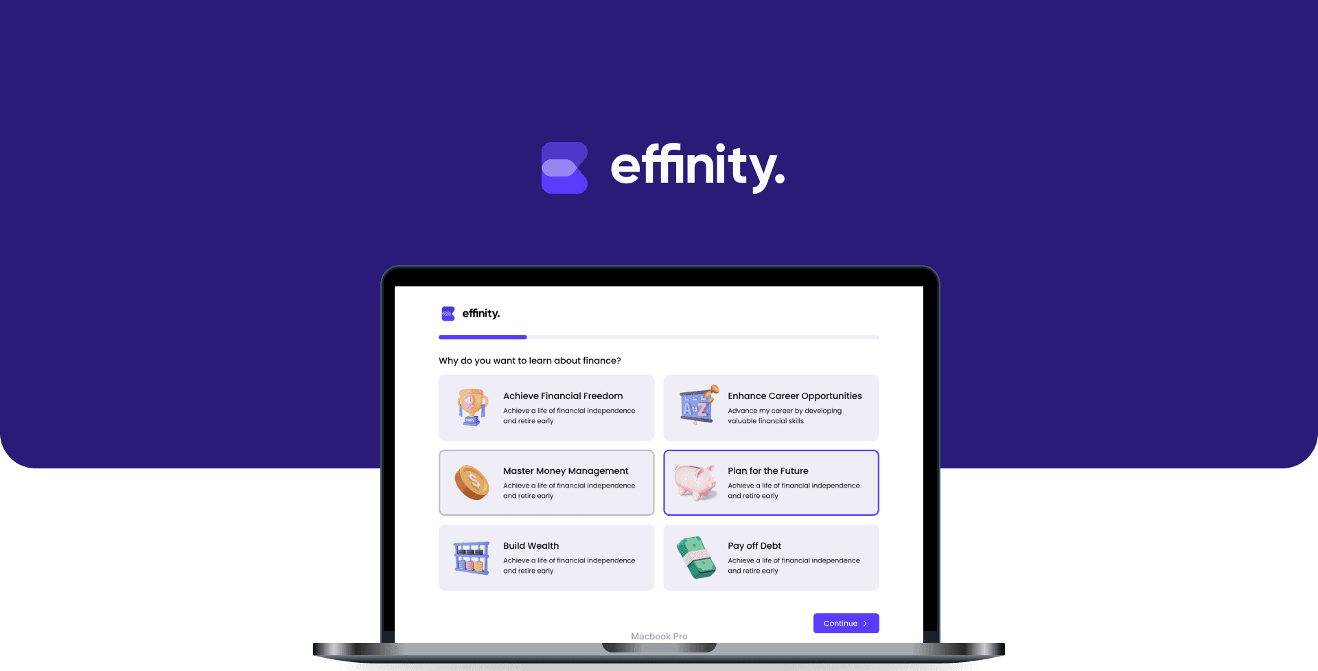
Financial literacy is an ongoing challenge for young adults. Many find personal finance dull or intimidating, leading to low engagement and knowledge gaps. Despite being digital natives, Gen Z exhibits the lowest financial literacy levels among recent generations, with only 28% correctly answering basic financial questions.
Effinity's goal is to transform financial education through a gamified website, making learning enjoyable and accessible. By offering interactive lessons, we aim to address financial illiteracy, empowering users to make informed decisions and achieve financial well-being.
Role
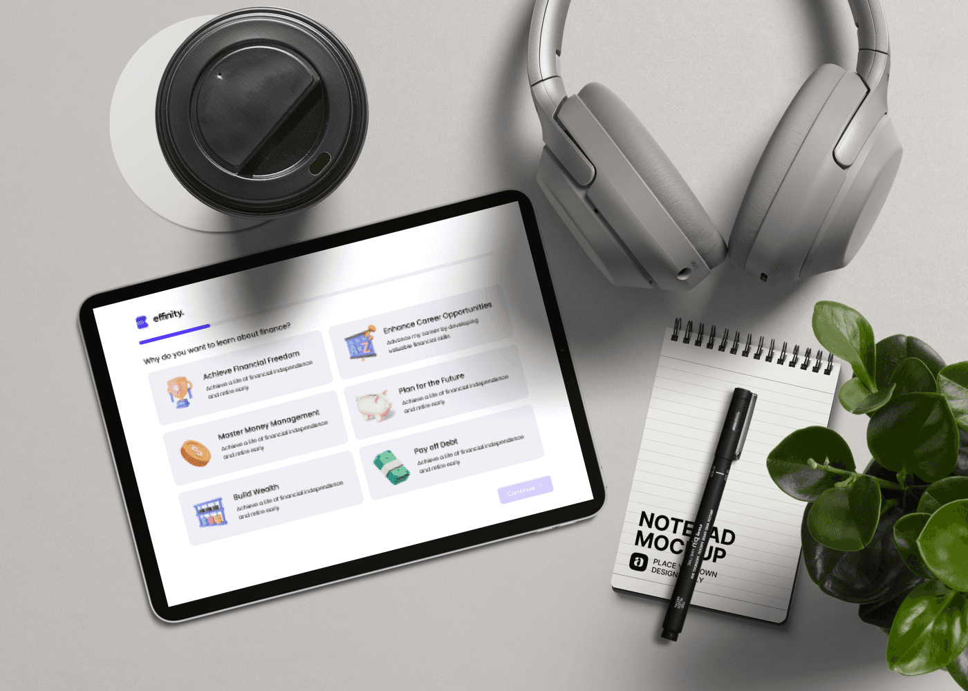
When I joined Effinity, the platform already had a product strategy in place, but one critical area needed design was the onboarding. Financial learning can feel overwhelming, and without an engaging onboarding process, users risked dropping off before even experiencing the platform’s value.
As a product Designer, I led the design of Effinity's onboarding flow, dashboard, navigation menus, and lesson plans.
The Problem
Why Onboarding Was a Critical Design Focus
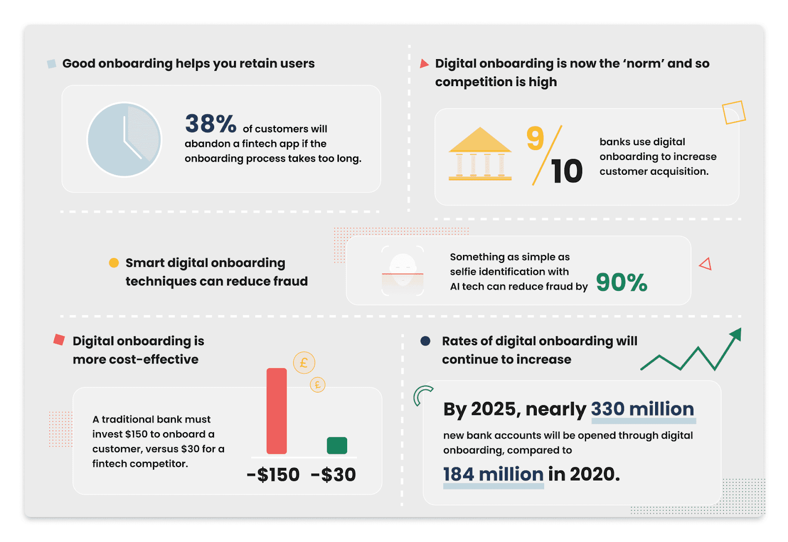
Financial learning is overwhelming for Gen-Z, with studies showing they have the lowest financial literacy levels of any recent generation. To drive engagement, Effinity’s onboarding needed to be simple, motivating, and effective.
Research shows that highly engaged users are 90% more likely to stay and generate 3x more long-term value compared to disengaged users. Additionally, the cost of acquiring new users is 5 to 25x higher than retaining them, meaning Effinity’s success depended on a strong onboarding experience.

"What are the biggest challenges you've faced while trying to learn finance?"
What has helped you learn about finance the most?
What features or benefits would make such a platform worth the investment for you?
"A lot of contradicting information out there - just want a single source of truth!"
“Talking to more people with more experience than me.”
"I love me a good incentive."
"Finance is intimidating to learn alone"
"I struggle with math and do not like things to be text-heavy."
"I would want ways to access and utilize my money, like virtual games"
❗️ Core Challenges
Many users find financial topics confusing or intimidating, making it easy to give up.
If onboarding feels like a lecture, users lose interest fast.
People get overwhelmed when hit too much info at once.
Credibility and a single source of truth is what users strive to have.
Product Strategy
How might we a personalized and engaging onboarding experience that adapts to each user's unique learning journey?
Main Features
Through brainstorming, I found these features to be most important for the flow:
Learning Through Your Hobbies
Gradual Engagement and Bite-Sized Interactions
Interactive and Visually Appealing Elements
Rewarding Users for Quick Wins
Designing the Onboarding
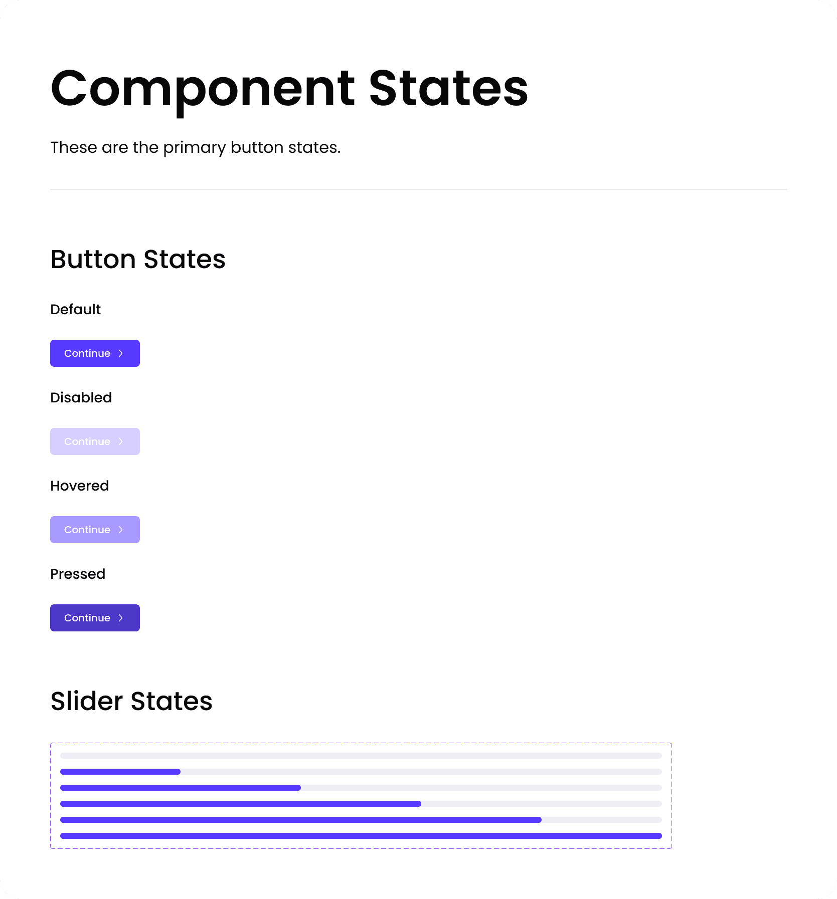
Designing the Components
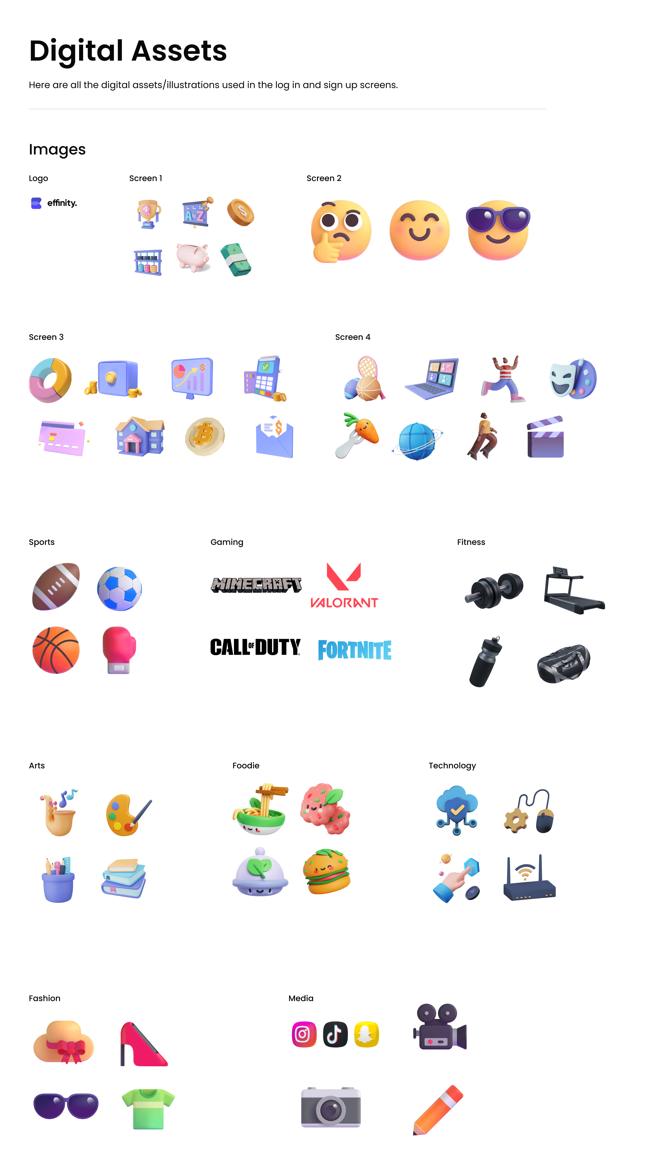
Searching far and wide, I found assets across the web create our digital assets, which would be helpful for the design. I focused on 3D, bold, fun and colorful assets which would entice new users.
To understand how users navigated Promptlys and where they got stuck, I ran a usability test with five participants across three core tasks. The goal was to catch friction points, measure success rates, and see how intuitive the platform felt.
What We Found
People liked the UI—it felt clean and modern.
Navigation was smooth for the most part.
Users needed better onboarding—some weren’t sure where to start.
Text-heavy sections felt overwhelming—collapsing certain areas would help.
The experience differed for logged-in vs. anonymous users—this needed clearer paths.
What We Fixed
Made the sidebar sticky for quick access
Added tags to different between GPT-3.5 vs. GPT-4 prompts.
Renamed “Collections” to “Saved Prompts” for clarity.
Made key sections collapsible to reduce visual overload.
Cleaned up redundant buttons for a sleeker experience.
These changes made finding, saving, and contributing prompts easier, reducing user friction and ensuring a more intuitive, engaging experience.
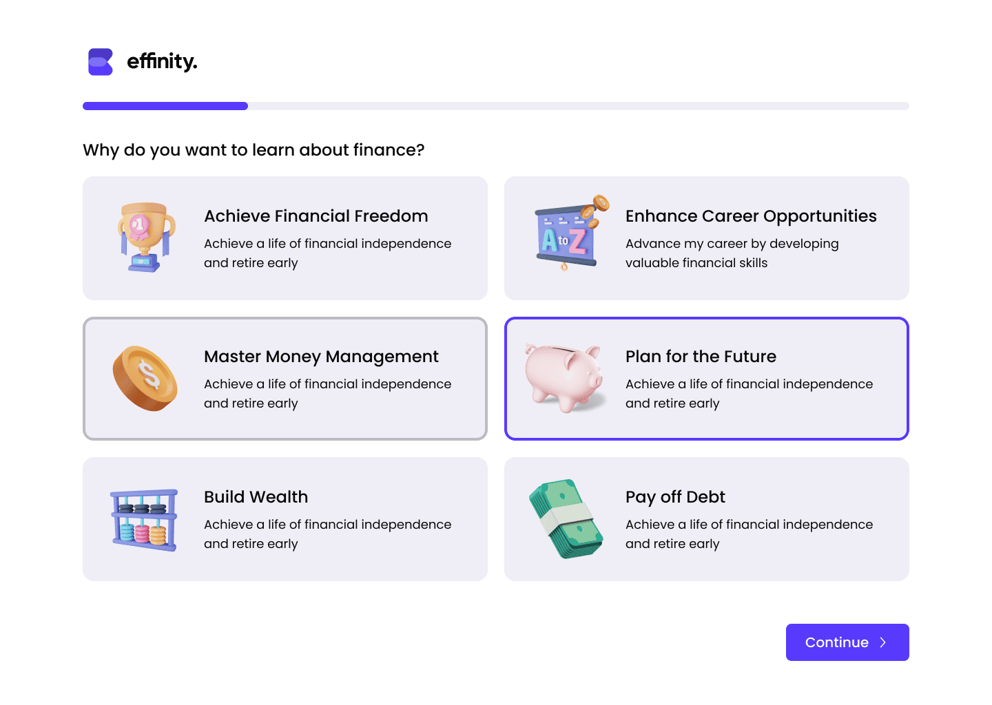
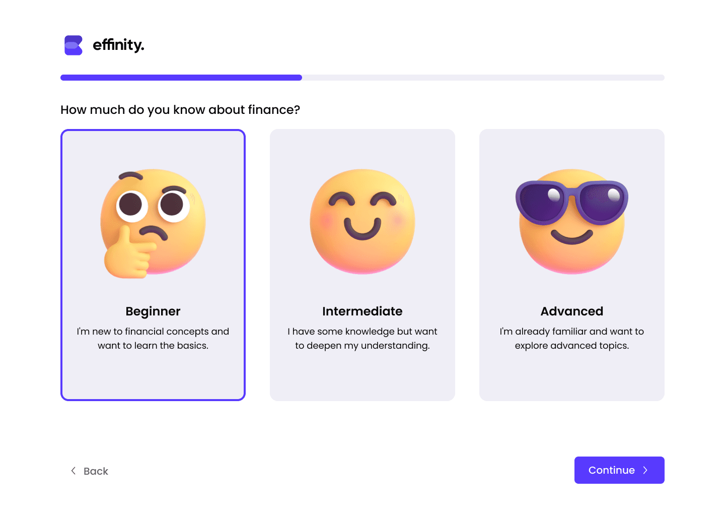
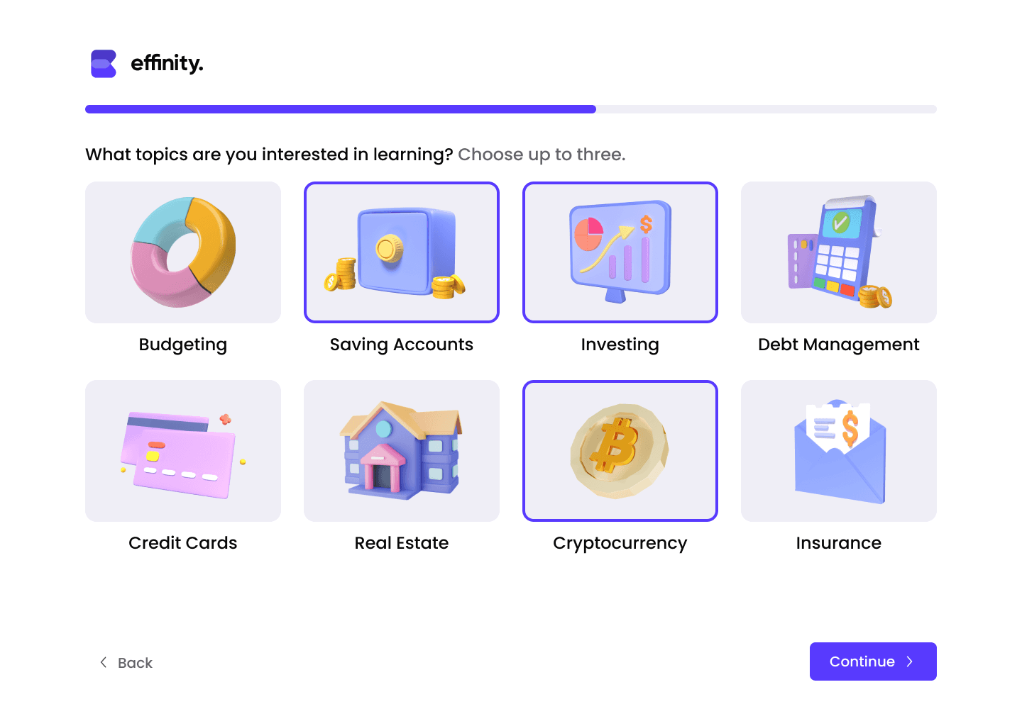
So, what are the results of this onboarding process?
Most users finished onboarding in just 1-3 minutes, making it a smooth start.
95% gave it a high rating, showing they enjoyed the experience.
Users felt motivated to dive into finance and explore their dashboard right away.
