Designed onboarding to drive Gen-Z engagement for platform sign-up
Effinity is a financial learning platform for Gen Z, created to make personal finance feel less overwhelming and more culturally relevant through gamification and interactivity.
When I joined, a product strategy was in place, but onboarding was missing. The challenge: build trust and motivation fast, or risk losing users before they ever learn a single financial concept.
I led the design of Effinity’s onboarding flow, from research and ideation to dev handoff.
The Problem
Most Gen Z users bounce before ever engaging with learning tools, especially in topics like personal finance. Without a clear, structured entry point, learners dropped off before discovering the platform’s value. Early drop-off posed a major threat to driving learning outcomes and long-term retention.
"A lot of contradicting information out there - just want a single source of truth!"
- Sam
“Talking to more people with more experience than me.”
- Sam
"I love me a good incentive."
- Sam
"Finance is intimidating to learn alone"
-Tammy
"I struggle with math and do not like things to be text-heavy."
-Tammy
"I would want ways to access and utilize my money, like virtual games"
-Tammy
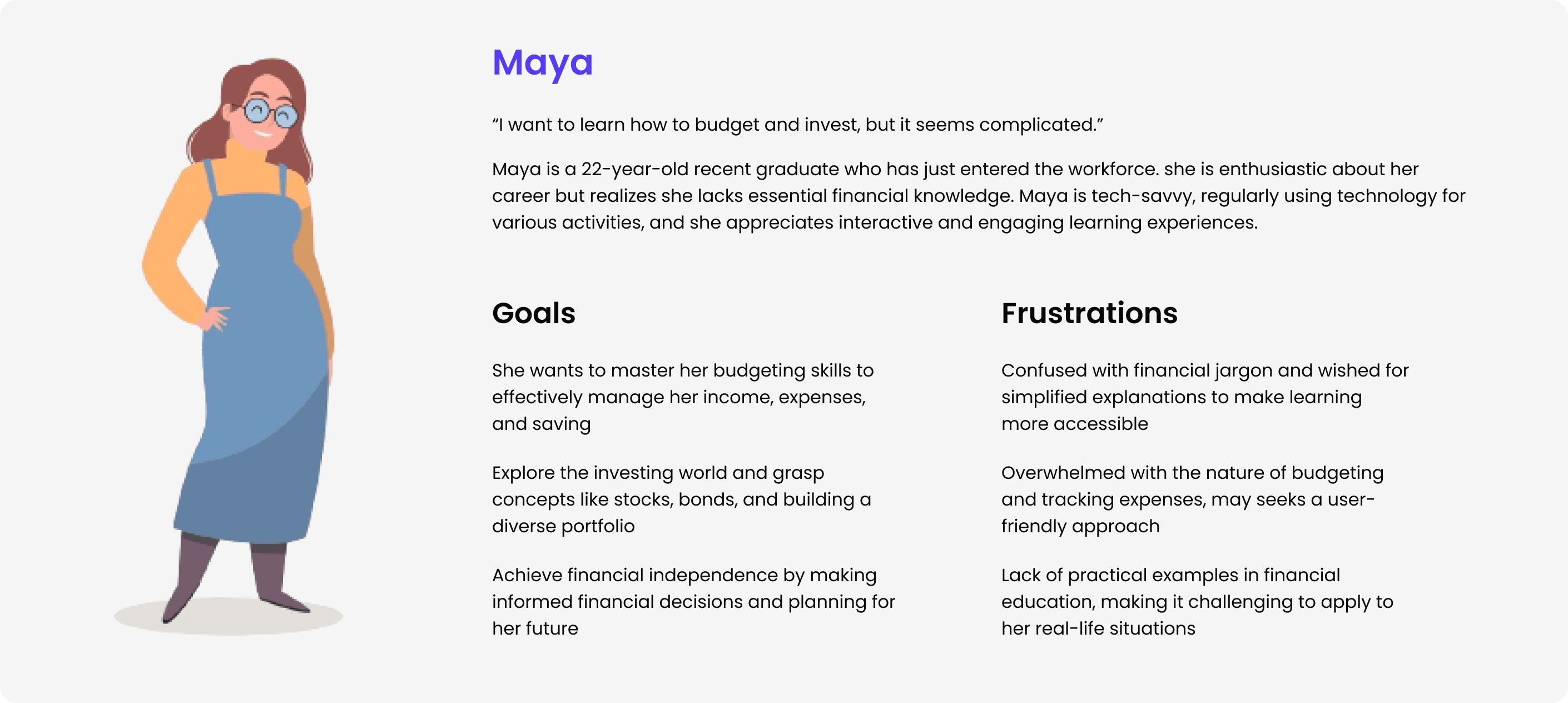
❗️ The Core Insights
People feel overwhelmed by information overload.
Students are loses trust with contradicting sources on the internet when it comes to financial education.
Gen-Z responds well to interactive, bite-sized, hobby-centered learning.
Product Strategy


🎨 Playful UI
Bright, expressive visuals tailored to Gen Z
🎁 Quick Wins
Early micro-rewards for momentum
🧠 Hobby-Based Learning
AI-personalized content to make finance feel relevant
Success Metrics
To gauge the impact of our onboarding flow, we tracked the following:
1
Onboarding Rate
3
Time to Learning
2
Qualitative User Feedback
4
Adoption Rate
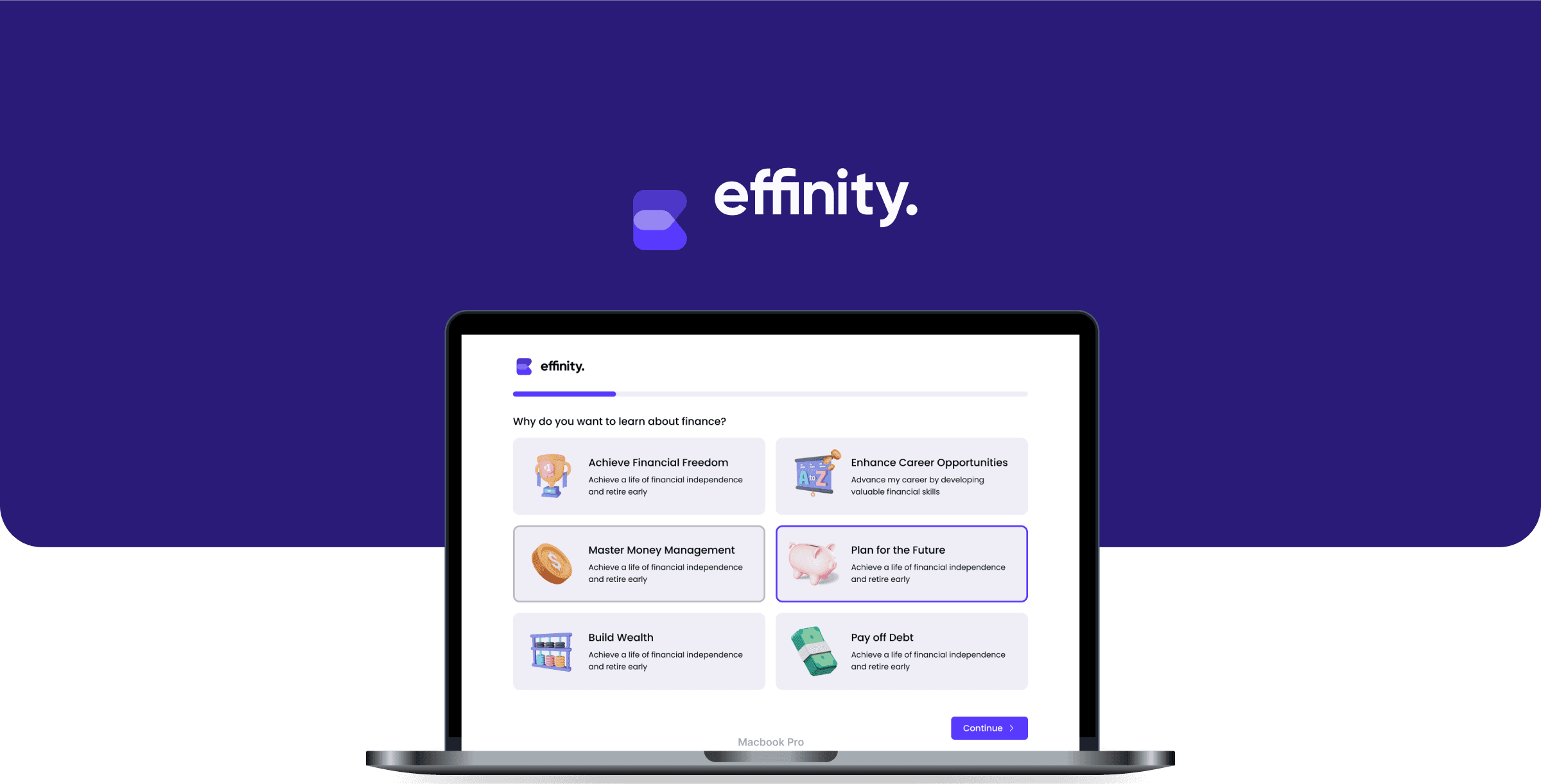
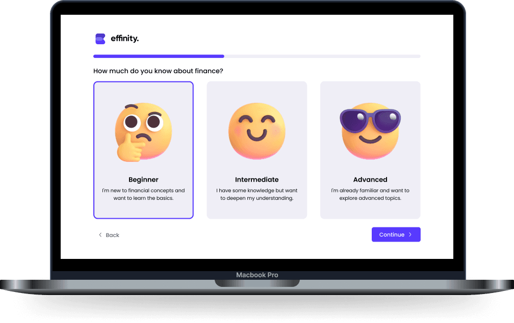
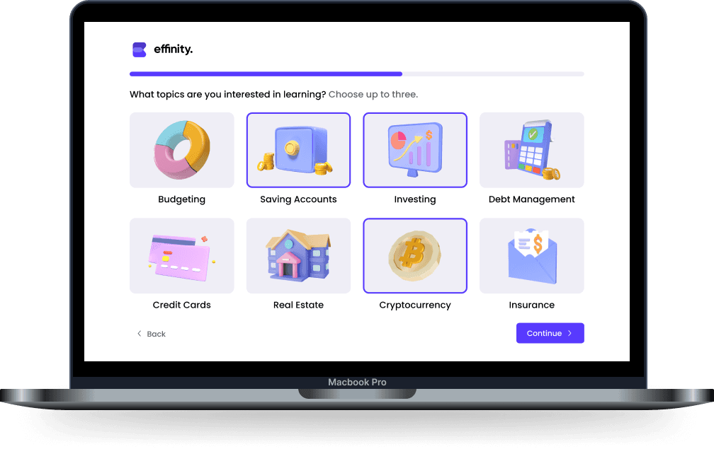
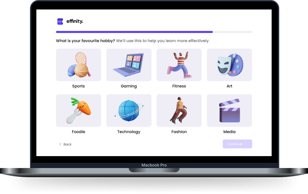
Wireframes
We broke down onboarding into 5 micro-steps, with clear progress shown on each screen. The goal was to keep the experience under 3 minutes and maintain a fast, gamified flow. Based on user insights, we made the following design decisions:
Reduced steps from 7 to 5 for faster completion
Removed “Back” and “Continue” pagination in favor of a progress slider to reduce confusion
Switched from empty to pre-selected states in multi-select screens to minimize decision fatigue and keep momentum


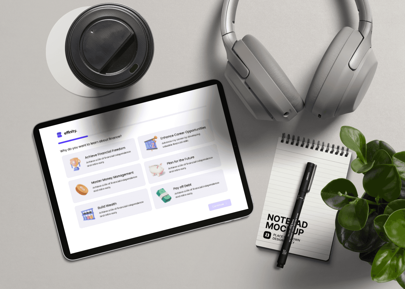
Visual Design
To bring the onboarding to life visually, I sourced custom digital assets with a playful 3D aesthetic that aligned with Gen Z’s design culture.
The goal was to build trust through warmth and personality, using saturated neons set against deep background tones to create contrast, while keeping the tone friendly, encouraging, and never patronizing. The visual direction helped make finance feel approachable.
The Handoff
I worked closely with engineers in daily standups to refine transitions, simplify interaction states like select vs. active, and align logic across mobile and desktop views. Annotated specs were delivered in Figma with interactive flow notes, and we shipped the onboarding in two phases using feature flags to A/B test performance.
What are the results of this onboarding process after launching to beta users?
Takeaways
Designing for Gen Z isn’t about flash. It’s about respecting attention. This project pushed me to think like a marketer, not just a designer, breaking down intimidating topics without watering them down, and leading a UX process that could scale far beyond onboarding. Effinity’s onboarding now serves as the foundation for their product roadmap and has been credited for strong early retention.